In 2009, usability expert Jakob Nielsen argued that, when done right, mega menus could enhance usability. Mega menus have a few notable advantages over traditional, hierarchical dropdowns or more spare navigation.
If poorly implemented, though, they can spell disaster.
Usability Advantages of Mega Menus
- All options visible. A traditional dropdown menu hides almost all options from a site visitor until she hovers over the parent category. If she does not think with the same hierarchy as the site architect, she will have to play Treasure Hunt, hovering over many parent items to find an item. This can lead to frustration if the dropdown keeps disappearing. In the best cases, a dropdown is like playing Concentration where you have to remember where the matching card was. Put another way, a good mega menu merely demands recognition, whereas a dropdown demands recall, which is much harder.
- Organizing options. Mega menus allow friendly and visual groupings. A traditional dropdown becomes completely dizzying when the number of options gets too large.
- Images and Icons. Often, mega menus are designed to have images or icons that correspond to, and quickly confirm for the visitor, the content of the menu. So the Contact category might be illustrated with an address book or telephone icon or some such thing.
Usability Concerns
So mega menus are a no-brainer right? What could go wrong? As it turns out, plenty. Jakob Nielsen has highlighted a few mega menu usability issues. Usability expert Jared Spool noted early on that mega menus could get you into trouble in his article on 6 Epic Forces Battling Your Mega Menus. Usability aside, Spool explains the sudden popularity of mega menus thus:
Mega menus seem like such a good idea. After all, they make the marketing team happy, as they remove all that nasty navigation away from the prime real estate of the home page, leaving room for the team’s messaging goodness. At the same time, the mega menu gives the design team a rich sandbox to play in, with much flexibility on how they display the site’s main links.
He lays out his six arguments against mega menus, most of which are in fact not unique to mega menus at all and I don’t find them inherently problematic (not that germane here; scroll to the bottom of the article for some thoughts on Spool’s six problems).
I am not nearly as hostile to mega menus as Spool, but the it’s easy to see some of the issues that might arise with mega menus.
- Forest of Options Obscures the Trees. I know, that metaphor usually runs the other way around, but with mega menu, you often see a pretty forest, but have trouble finding the tree you want. You can see in the screenshot below a site that has succumbed to the temptation to make the mega menu into a sitemap (click image to enlarge).
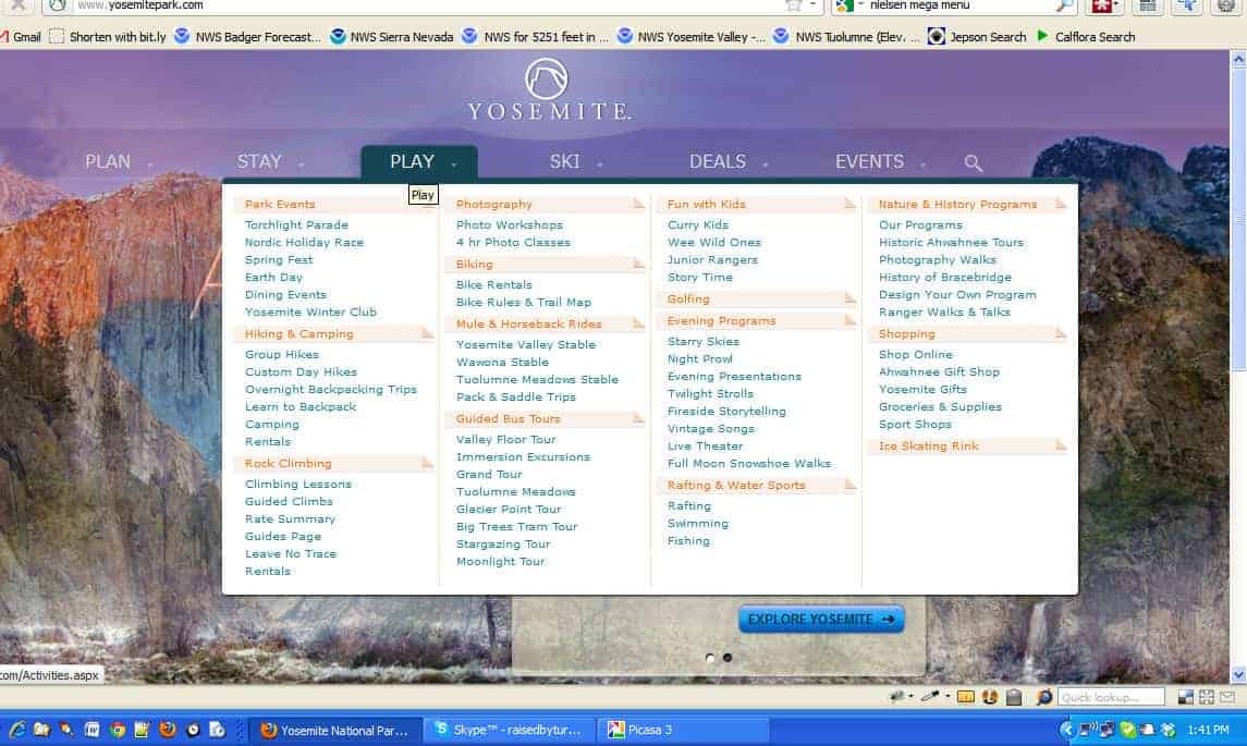
Since you can throw in every imaginable option, you do. As a result, the user is presented with a dizzying array of options and, one might guess, becomes paralyzed by the number of options.
It creates an easy out for designers and site architects who don’t want to make choices. At a certain point, the number of options becomes visually distracting and difficult to read.
- Screen Size problems. This is not unique to mega menus. This can be a problem with options dropdowns (i.e. select boxes) that have long options or standard dropdown menus if they get big enough. The problem is that the mega menu is, well, mega, so this is a lot more common. You can see from this screenshot that mega menus can become completely non-functional if the window is narrow, as on a mobile device, or short, as on a netbook [update: all of these concerns should be handled today by even a marginally functional responsive design] (click images to see full-sized):
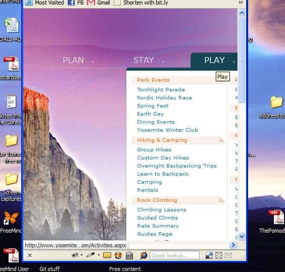
You can see that the mega menu is cut off on a narrow or a short screen. With a mega menu, however, the user usually cannot scroll! Why? Because it only stays displayed when the mouse is hovering over the menu.
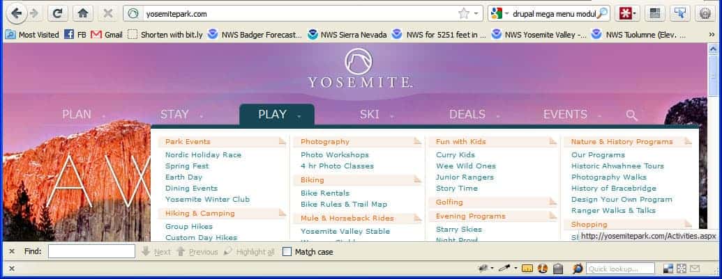
The Yosemite Park site solves this by allowing you to click on the root term and be taken to an index page, where the sub-options are displayed by default. That means the user needs to know, or guess, that the root term is a link and is clickable. It would be interesting to track visitors and see how they ultimately use this navigation.
This was part of what ultimately took the blush off mega menus for me personally. I just found that you compound implementation problems and if you’re not careful and don’t test on a lot of platforms, you have a high chance of letting a significant usability problem creep in. In addition, I was also concerned with the SEO impacts of mega menus (next section) ——».
Addendum: Spool’s issues with mega menus
If you’re really interested in Jared Spool’s Six Epic Problems, here’s a quick rundown with Jared’s criticism in italics and my responses in regular text.
- Menus are not Buttons. Since a menu isn’t a button, users don’t know they have to do something to make it expand. Realistically, even if visitors do not know the menu expands, they will attempt to click and when their mouse comes over the menu, they see more options revealed. It’s better than not expanding.
- Missing Trigger Words. In other words, since most options are hidden, users can’t see that they exist. Short of the navigation taking up the whole page as a sitemap, you’re not going to change this.
- Category Names not always inherently sensible. Well, of course not. This is a problem with any navigation and, again, is an information architecture problem more than a user interface problem.
- Users Wait Before Moving Their Mouse. In other words, if they can’t see what they want, users sit there paralyzed and won’t click anything at all. Again, mega menus aren’t the root problem. If the design only allows, say, seven navigation links, then that’s what there is and they may not always have enough information scent to get the user to click. It is ultimately irrelevant whether on hover those menu items reveal nothing, a cascade of hierarchical dropdowns, or a mega menu.
- Mega menus hide the information that’s under them. That’s a problem when the user accidently hovers over the menu while trying to read the content, which suddenly get’s hidden. That can be annoying, but in a minimally usable design, the mega menu should disappear simply on mousing out.
- Problems with hoverless devices. As we move to devices that don’t have cursors and mouses, they can have trouble triggering the menu expansion. Of course, this again is not unique to mega menus, but concerns anything that uses hover behavior as a trigger. This has become so ubiquitous that I think this is largely solved by most devices these days [update: again, responsive design has several ways of dealing with this effectively].
Read on about the SEO impacts of mega menus (next section) ——».
Jared seemed to be saying that Mega menus had disappeared from the Amazon website (this was in 2011), but in 2020 I can see a couple in the header: one for Accounts & Lists, and one for the country version.
It seems there’s a cycle: new UI concept > solves some problems > hype > declared answer to *the* question about god, the universe and *everything* > used by all > abused by some who push it to absurd limits > articles warning against abuse > declared to be the most horrible thing since WW2 > time passes > dust settles > rediscovered as a useful tool.
It’s a bit like the biopics of musicians (Ray, Walk the line, La Môme): childhood traumas > starts playing music > shows talent > rapid rise to fame > glory > abuse of all kinds > depression, alcohol > realization they went astray > final serenity.
Yeah, that article is WAY old and I too have seen some nicer mega menu implementations. I think originally, mega menus were like carousels: they let designers avoid making decisions or they let each department have space on the front page/navigation header. That, of course, leads to stupid information architecture. But then you apply solid principles to them and you can have a nice experience for those with large screens that might actually save some clicks.
Of course, there is also the old saw about being wary of copying Amazon. Most Amazon and YouTube visitors are regulars, so they will learn a UI. So that means you might sacrifice some usability for new users in order to improve usability for your regular customers. Most websites, however, do not have those levels of returning traffic. So what works for Amazon may not work for you.